

No matter what type of printing process you choose, your artwork preparation is key to a high-quality print. A well-prepared design ensures bold colors, crisp details, and long-lasting prints on your t-shirts. But don't worry—you don't need to be a design expert to get it right! Whether you're printing for a brand, an event, or just for fun, we'll walk you through the simple steps to prepare your artwork for perfect custom t-shirt prints. Let's dive in!
Section 1: Artwork Separation – Setting Up Your Design for Perfect Prints
No matter what type of printing process you choose, your artwork preparation is key to a high-quality print. A well-prepared design ensures bold colors, crisp details, and long-lasting prints on your t-shirts. But don't worry—you don't need to be a design expert to get it right! Whether you're printing for a brand, an event, or just for fun, we'll walk you through the simple steps to prepare your artwork for perfect custom t-shirt prints. Let's dive in! 🎨👕
Before we begin printing, let's discuss a crucial step—artwork separation. This means preparing your design in a format that works best for screen printing. Don't worry if you're not a designer; we'll explain it step by step!
✔️ Accepted Art File Types for Screen Printing
For the best print quality, we accept the following file formats:
✅ Illustrator (.AI)
✅ Vector (.EPS)
✅ Photoshop (.PSD)
✅ JPEG
✅ TIFF
While we accept multiple formats, we highly recommend submitting your artwork in .AI, .PDF, or .EPS format. Why? Because vector files allow us to resize your design without losing quality, ensuring crisp, clean prints on your t-shirts.
🎨 Step 1: Set Your Artwork to the Right Size
One of the biggest mistakes people make is leaving the resizing to the printer! You have complete creative control, so always set the exact size of your design before sending it off.
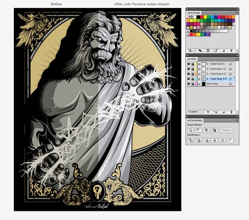
For example, let's say we're printing an illustration of Zeus (because who doesn't love a powerful, bold design? ⚡). We set our canvas size to 14″x17″, ensuring the artwork is perfectly scaled. The design contains 4 colors, and we've set the Color Mode to CMYK (Cyan, Magenta, Yellow, Black)—the best format for printing vibrant colors. Here's a preview of the design:
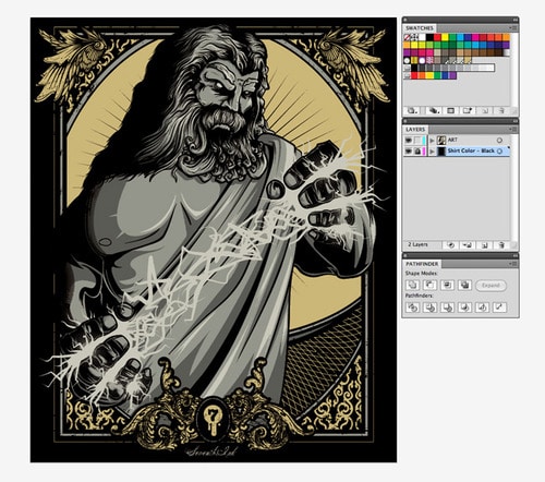
🎯 Why This Step Matters?
🔹 No unwanted resizing – You get the exact print size you envisioned.
🔹 Sharper details & better color accuracy – Especially when working with multiple colors.
🔹 No surprises! – The final t-shirt print will match your expectations.
Now that we've set up the artwork let's move to the next step—separating colors for printing like a pro! 🚀
🎨 Step 2: Separating Your Artwork for a Perfect Print
Now that we've set up our artwork, it's time to separate the design properly to ensure a flawless screen print.
Organizing Your Layers Like a Pro
We keep two separate layers in our file:
✅ Layer 1 – The Design (This is your actual artwork.)
✅ Layer 2 – The T-shirt Color (This helps us preview how the design will look on the final t-shirt.)
Pro Tip: Lock the t-shirt color layer throughout the process. This prevents accidental changes and ensures we're only working on the artwork itself.
To make things easier, we have three essential toolbars open:
🟡 Swatches – To manage colors efficiently.
🟡 Layers – To keep elements organized.
🟡 Pathfinder – To combine and modify shapes.
🎨 Step 3: Converting Text & Strokes to Outlines
Before sending the artwork to print, we need to convert all text and strokes into outlines so the printer reads them as shapes, not editable fonts. Here's how:
1️⃣ Select Everything
- Go to Select > All or press Command + A (Ctrl + A on Windows)
2️⃣ Convert Text to Outlines
- Go to Type > Create Outlines or press Command + Shift + O (Ctrl + Shift + O on Windows)
- This ensures your text remains sharp and won't change if the printer doesn't have the same font installed.
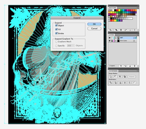
3️⃣ Expand Strokes & Shapes (This is a two-part process!)
- First, select all artwork and go to Object > Expand Appearance
- Select everything again and go to Object > Expand
- A box will pop up—make sure Object, Fill & Stroke are all checked, then hit OK
🎯 Why This Matters?
🔹 Ensures text and strokes print exactly as intended.
🔹 Prevents missing fonts or unexpected design changes.
🔹 Keeps your artwork print-ready without last-minute fixes.
Now that our design is fully outlined and expanded, it's ready for color separation—the final step before printing!
🎨 Step 4: Separating Colors – The Magic Happens Now!
Now that your artwork is fully expanded into shapes, it's time to separate it into individual colors—the fun part! 😎
Ungrouping Your Artwork
First, we need to ungroup everything so that we can work with each color separately. Don't worry if you don't see any changes right away—this step is crucial!
1️⃣ Select All Your Artwork
- Go to Object > Ungroup or press Command + Shift + G (Ctrl + Shift + G on Windows)
2️⃣ Repeat Ungrouping
- Sometimes, objects are grouped more than we realize, so we'll ungroup a couple of times to ensure everything is separated. Then, select everything again and repeat the ungroup process.
🔧 Why Do We Do This?
You may not see anything change visually, but this ensures that every element of your design is entirely separated and ready for the next step. If we skip this, we might run into problems later.
Now, Let's Do Some Magic with Pathfinder!
It's time for Pathfinder to work its magic.
1️⃣ Select All the Artwork Again
- Now that everything is ungrouped, select all of it again.
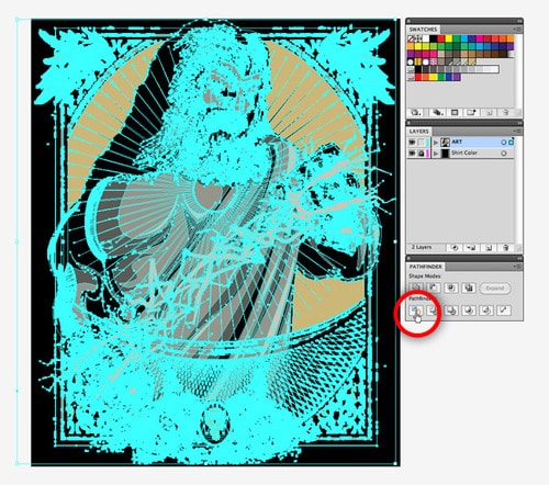
2️⃣ Click on the Divide Button
- Head over to the Pathfinder toolbar and click the Divide button (it's in the bottom left corner).
What Happens Next?
This button will flatten and separate your design by color, leaving you with many fragmented shapes—one for each color!
🎯 Why This Matters
This step helps you prepare the design for printing by breaking it down into individual colors. This makes it easier to apply the right ink and print each layer correctly. Plus, it ensures no colors overlap when your t-shirt is printed, giving it that crisp, professional look.
Now that we've got each color separated, it's time to prep for the final touch—adjusting and exporting your file for print. Let's keep going! 🚀
🎨 Step 5: Combining Color Pieces – Magic Wand to the Rescue!
Now that we've separated the design by Color, it's time to combine the pieces for each Color into one solid shape. Don't worry—this step is more straightforward than it sounds!
Ungroup and Use the Magic Wand Tool
Once we've divided the artwork, we must ungroup everything again to ensure each Color is treated separately. Then, we'll use the Magic Wand tool to group all the pieces of the same Color into one shape.
1️⃣ Ungroup Everything Again
- Make sure to ungroup all pieces to work with each Color independently.
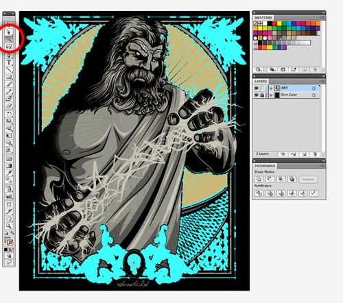
2️⃣ Use the Magic Wand Tool
- Select the Magic Wand tool (it's the little wand icon in the Tools toolbar).
- Double-click the icon to adjust its settings and set it to Fill Color (since we're working with shapes, not strokes).
Selecting All Pieces of One Color
Here's where the magic happens! 🪄
1️⃣ Click on the First Color
- With the Magic Wand tool selected, click on the first Color you want to group together. The tool will automatically select all the shapes that share that Color.
2️⃣ Repeat for Each Color
- Do this for each Color in your design (we have four colors in our example).
🎯 Why This Matters
Combining all the shapes of the same Color into one solid shape ensures that each Color is properly isolated. This makes it easier to print each layer cleanly, with no accidental overlapping colors. Plus, it gives you that crisp, vibrant look on your final t-shirt!
With each Color neatly combined, we're ready for the final touch—preparing your file for export. Let's move forward! 🚀
🎨 Step 6: Unifying the Colors – Making One Solid Shape!
Now that we've selected all the pieces of one Color (like our gold pieces), it's time to combine them into one single shape. This ensures everything stays neat and clean for the screen printing process. Let's use the Unify tool in the Pathfinder toolbar to do that!
Combining the Pieces with the Unify Tool
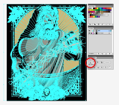
1️⃣ Hold the Alt Key & Click Unify
- Once you have selected all the gold-colored pieces, hold the Alt key on your keyboard and click the Unify button in the Pathfinder toolbar.
- This will merge all the pieces of that Color into one solid shape!
2️⃣ Expand the Shape
- After unifying the Color, you'll notice the Expand button will become active in the Pathfinder toolbar.
- Click Expand to complete the process for that Color.
3️⃣ Repeat for Other Colors
- Now, do the same for each remaining Color in your design, one at a time.
🎯 Why This Step Matters
By unifying the pieces of each Color, we ensure that each Color stays intact and consistent when printed. This also ensures that the printer can handle your design smoothly, giving you clean, sharp prints on your T-shirts.
Once all the colors are unified, we're almost ready to export and finalize your artwork for screen printing! 🚀
🎨 Step 7: Organizing Layers & Choosing PMS Colors for Precision
Now that each Color is unified into a single shape, it's time to organize everything neatly and pick the Pantone Matching System (PMS) colors to ensure accurate printing. Let's go step by step!
Create Layers for Each Color
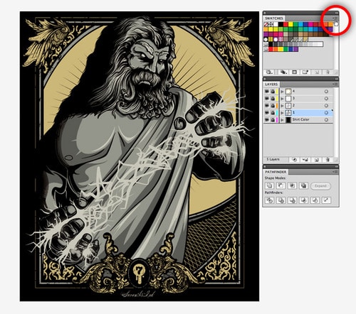
1️⃣ Create a New Layer for Each Color
- For each Color in your design, create a new layer and assign the corresponding shape to its own layer.
- We usually start by placing the lightest Color on the bottom layer and work our way up to the darkest Color at the top.
🎨 Step 8: Choosing PMS Colors – Getting the Perfect Print!
Now, to make sure your colors are printed as accurately as possible, we need to assign Pantone colors. Your printer will use these universal colour swatches to replicate your colors perfectly.
1️⃣ Open the Pantone Swatch Library
- In the Swatches toolbar, click the button at the top-right and go to Open Swatch Library > Color Books > PANTONE Solid Coated.
2️⃣ Select the PMS Colors
- This will open a window where you can pick the Pantone colors that match your design. These will replace the current colors in your artwork and ensure color consistency during the printing process.
🎯 Why This Matters
Using Pantone colors helps ensure that your custom t-shirts will have the exact colors you want, no matter where or when they're printed. This step is key to getting that perfect, professional look every time!
With everything set up, we're almost ready to finalize and prepare your design for printing! Let's move to the last steps. 🚀
🎨 Step 9: Choosing the Right PMS Colors – The Final Touch!
Picking the right Pantone colors is critical to ensure your screen-printed design looks exactly like you imagined. Here's how to do it with precision:
Why We Recommend Pantone Color Bridge Swatch Books
Although the colors you see on the screen are a great start, screen settings and brightness can distort them. This means that the colors in the Swatches toolbar may not be accurate to what they'll look like when printed.
To avoid mistakes, we highly recommend using Pantone Color Bridge swatch books. These books are the most accurate way to match colors, as they show how the ink will look in real life.
Pro Tip: One swatch in the toolbar can look very different from another, so the Pantone Color Bridge book helps ensure the colors are exactly what you want. This is an essential step before going to print!
🎨 Step 10: Matching Your Colors with the Pantone Books
1️⃣ Find the Right Colors in the Pantone Swatch Books
- We look through the Pantone books to find colors that match the ones we used on-screen. Sometimes, we need to adjust the colors to make sure they work well together.
2️⃣ Use the Find Feature in the Pantone Swatch Window
- In the Pantone Swatch window, click on the upper-right button and choose Show Find Field. This will make it easier to search for the exact Color you need.
3️⃣ Select the Color to Replace
- Before clicking on a Pantone color, select the artwork corresponding to the Color you want to replace. Once you find the right Pantone Color in the swatch library, click on it, and it will replace the current Color in your artwork.
🎯 Why This Matters
The Pantone Color Bridge books are essential because they give you a physical reference for colors, ensuring what you see on-screen matches what you'll get in print. Colors can appear differently on screen, but the Pantone book gives you the final, accurate Color you'll see on your t-shirt.
After replacing all the colors with Pantone swatches, you'll see a noticeable difference between your original and final printed colors. This step guarantees your design will come out just as you want on the finished product! 🎨👕
🎨 Step 11: Final Adjustments and Mockup for Printing
After selecting the Pantone colors, the final printed design turned out even closer to our desired look. This is because we could adjust our choices as we worked with the Pantone Color Bridge book. With the physical swatches in hand, we could carefully pick the perfect colors to match our vision.
Organizing Layers with Pantone Colors
As we made these changes, we also made sure to name each layer with the corresponding Pantone Color used for that layer. This helps us stay organized and ensures that the printing process goes smoothly.
🎨 Step 12: Quick Mockup – Seeing It Come to Life
Now that our artwork is ready for print, it's time to create a quick mockup. This will help us visualize the size and placement of the design on the t-shirt. The mockup gives us a final check to ensure everything looks just right before we send it off to print.
And that's it! Your artwork is now print-ready, and we're one step closer to seeing it on your custom t-shirts! 👕
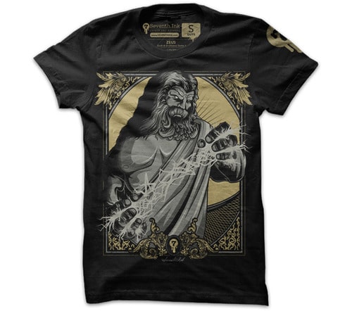
Section 2: Mockups – Visualizing Your Design on a T-Shirt
Creating a mockup is a simple but crucial step in the design process. It may seem like a small detail, but it's just as important as the artwork separation because it helps you visualize how your design will look on a t-shirt.
Most designs are usually centered on the chest. Still, depending on your vision, you may want the artwork placed somewhere else. Doing a mockup gives you a clear idea of what your final product will look like.
Finding the Right Mockup Template
Plenty of mockup templates are available online—just a quick Google search will bring up tons of options! But for the best results, it's ideal to find a mockup template that represents the brand or style of t-shirt you're using for printing. This ensures your mockup is as close to the final product as possible.
To make things easier, here's a collection of free t-shirt templates you can use during the mockup phase. These templates will help you get a realistic preview of your design on a shirt.
Our Standard Mockup Template
We use a standard mockup template for our designs. Since our t-shirts are tag-less and feature a logo print on the sleeve, including these details in the mockup is essential. We also make sure to reflect the Pantone colors for the sleeve and any other print locations to maintain consistency.
🎯 Why Mockups Matter
A mockup ensures that you'll get a final product that matches your vision, down to the placement and Color of your design. It's your chance to fine-tune things before heading to the printing stage, making sure everything is perfect!
🎉 You Did It! Ready to Bring Your Design to Life
It's easy, right? Now that you've followed these steps, all that's left to do is package up your files and send them to us—we'll bring your design to life!
Quick Recap of the Screen Printing Process
Here's a quick summary of the steps we took throughout the process:
- Set the Canvas Size: Ensure the canvas is correct and set to CMYK color mode.
- Create Outlines & Expand: Outline your text and expand all artwork into shapes.
- Ungroup & Divide: Use Pathfinder to ungroup and divide your artwork into separate color fragments.
- Use the Magic Wand Tool: Select colors and unify the fragments using the Pathfinder tool for each Color.
- Distribute Colors to Layers: Create a new layer for each Color and assign the corresponding Color. Name each layer using the Pantone PMS color.
- Create a Mockup: Put your design on a t-shirt template to visualize placement and size.
And that's it! You've successfully prepared your design for screen printing. It may take some time, but once you get the hang of it, the process will become much faster and easier each time.
The Best Process for Quality Prints
We've refined this method over the years, and it's the best and quickest way to ensure that your artistic vision is communicated clearly to the printers. We hope this tutorial helps you bring your designs to life faster, more efficiently, and with stunning results!
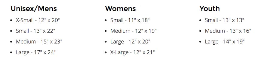
⚠️ IMPORTANT: Maximum Print Size – Stay Within the Safe Zone
It's important to note that not all t-shirts are sewn the same way. The dimensions provided here are a safe zone for your design, helping to avoid potential issues like printing over seams or edges.
📏 Always Check the Size Guide
To ensure your design fits perfectly, check the "Size Guide" for the t-shirt you're using. This will give you the most accurate measurements for that particular garment.
⚡️ Printing Over Seams – What to Expect
Heads up: If your design goes over a seam, it may cause imperfections in the print. While this is something to be cautious of, it can also create some unique, cool effects—if you're into that!